
(This post is part 2/2 in a series. For part 1, see: Part 1 : Instrumentation & Collection)
In part 1 of this series we went over how to instrument Fluentd so that it sends its errors and metrics to the monitoring services Datadog and Rollbar. In this post, we’ll cover how to effectively visualize and alert using those metrics.
Visualizing & Alerting with Datadog
Dashboard Template Variables

Before jumping into the visualization themselves, it would be helpful to see how we have templatized the variables in our dashboards, so that one can quickly change the scope of all visualizations in that dashboard. For a complete guide on this powerful Datadog feature, see their Guide to Dashboard Templating.
Template variables we use:
- $account-name: Account or environment name. Ex: “dev”, “stage”, “prod”, etc.
- $realm: Twilio is a multi-region SaaS provider. Realm is analogous to the geographic region of a host. Ex: “usa”, “brazil”, “japan”.
- $role: Functional type of the host. Ex: “mysql-master”, “mysql-slave”, “kafka”, “sms-sender”, etc.
- $host: Host ID. We use an internal instance ID at Twilio, but AWS instance ID would also work.
- $fluentd-tag: Thanks to the custom fluentd/dogstats instrumentation we built in part 1 of this post, we have metrics on bytes/sec and messages/sec tagged with their Fluentd tag. Ex: “nginx_access”, “nginx_error”, or “haproxy”.
- $active: Load balancer state. Ex: “in-load-balancer” or “out-of-load-balancer”.
These template variables allow an operator to quickly modify all charts on a dashboard to visualize answers to questions like:
- How much memory is being used by Fluentd in “prod” on all “mysql” hosts?
- How much CPU is being used by Fluentd in “prod” by any 1 host?
- How many “nginx_access” messages/sec are being sent in “prod” in Japan by all “kafka” hosts that are in-load-balancer?
Fluentd Bytes/Sec & Messages/Sec
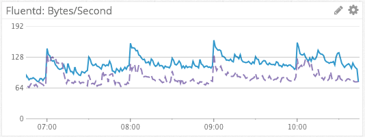
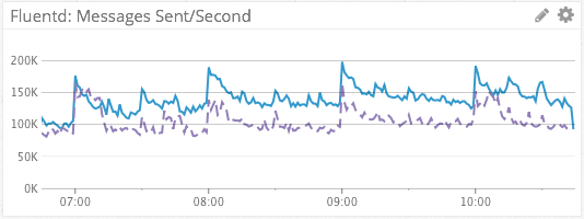
We visualize the sum of Fluentd bytes/sec and messages/sec across dimensions using the default, line graph visualization type, as rates. This simple, aggregated metric gives us a simple visualization of log message throughput. The dashed line in purple provides a week-over-week comparison, for context.
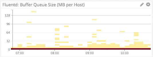
Fluentd Buffer Size
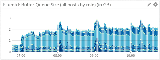
We visualize Fluentd’s on-host disk output buffer via the above two charts. The first chart uses the stacked bar visualization type, aggregated on “role”. The absolute height of each bar tells us the sum of all Fluentd disk buffers across an account. The individual components of each bar (the different shades of blue) each represent an individual role. From this we can quickly tell how much any individual role is contributing to the sum of all buffers.
The second chart uses the heat map visualization aggregated by “host”. Because Twilio operates thousands of instances in Amazon AWS, a line graph containing a separate series for each host would be far too noisy to derive any meaning from. This heat map visualization automatically scales from hundreds of hosts to thousands of hosts, while still maintaining the ability for an operator to derive meaning.
With regards to alerting, we have Datadog monitors setup to page us if the on-disk buffer of a given host reaches a critical threshold, or if the sum of all disk buffers across an account reaches a certain threshold. In our case, these alerts would be indicative of issues in forwarding log messages to AWS Kinesis.
Fluentd Retries
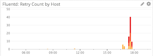
We specifically do not use a line graph for visualizing retries, as retries are relatively infrequent events and the line graph visualization would try to connect/interpolate points with lines.
Instead, we visualize Fluentd retries via a stacked bar graph. The absolute height of the graph shows us the number of retries, and each colored segment of the stack represents a distinct host.
A red color palette for the bars was chosen instead of the default blue color palette to indicate impending doom. 🙂
Fluentd CPU & Memory Consumption
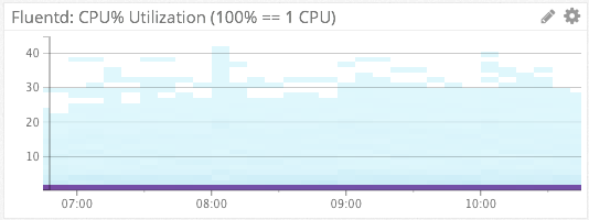
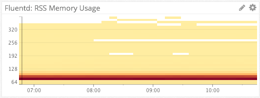
For Fluentd %CPU & memory consumption, we again turn the the heat map visualization type. Because each of these heat maps is aggregated by host, they can represent thousands of hosts in a simple chart. Ex: From the bottom chart we see that on the vast majority of hosts, Fluentd is consuming 70-90MB of RSS memory.
We have Datadog monitors setup to alert us via Slack if Fluentd is consuming >80% of a single CPU on any host, or page us via PagerDuty if Fluentd’s memory consumption becomes unreasonable.
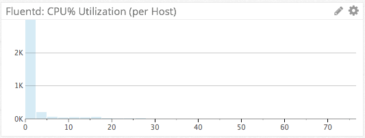
We can also use the distribution visualization type to view absolute numbers for the most recent sampling period. A distribution chart is basically a cross-section of the heat map chart rotated sideways, showing only a single period. This differs from the heat map in that a heat map shows evolution of the metric over time. Is this distribution, we can see that 2,000+ hosts have a Fluentd CPU utilization of <=5%, for the latest period.
Rollbar-Forwarder CPU & Memory Consumption
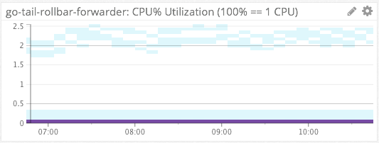
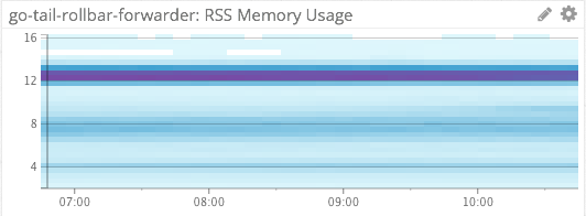
We similarly use heat maps to measure the %CPU and memory consumption of our file-tailing, rollbar-forwarder which is installed on each host.
Ingress vs Egress
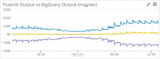
Since we use AWS Kinesis as a intermediate transport, it can be helpful to visualize data in-flow vs out-flow in order to determine where slow-downs in the data pipeline are happening.
The blue line in the chart above represents data flowing into Kinesis from Fluentd (ingress). The purple line at the bottom represents data read out of Kinesis by our Kinesis consumer (egress). The yellow line in the middle is a simple subtraction of the two series (B – A). If all is well and egress ~= ingress, then the yellow line should be right around 0.
The metrics for AWS Kinesis come from Datadog’s AWS integration.
Top Graphs & Change Graphs
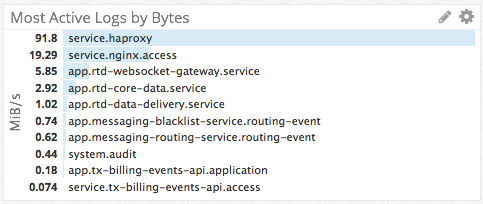
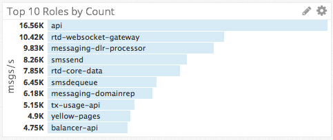
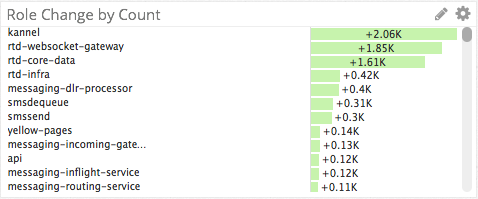
Thanks to the tags and dimensions we have applied to our metrics, we were able to create the top charts and change graphs to answer questions like:
- What log file is the top source of log messages?
- Which roles are the top producers of logs?
- Which roles are contributing most to a sudden spike in log messages?
Alerting on Fluentd Issues with Rollbar
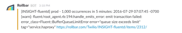
Using the go-tail-rollbar-forwarder app that I mentioned in part 1, we are able to get WARN/ERROR/CRIT log messages from Fluentd’s own log file into a SaaS service, so that we can be automatically notified about Fluentd issues. Other benefits of using Rollbar are that Rollbar will automatically aggregate and group similar messages from different hosts (see message about “1,000 occurrences…” above), and save us from having to log into machines to view Fluentd’s application log.
Since Rollbar was designed to be used by a logging library (Ex: log4j) and not as log aggregation service, we had to configure custom grouping rules to get Rollbar to group similar messages correctly. This was relatively simple to do using regex’s, but I mention it here for the sake of completeness.
Conclusion
I hope you found this guide on how to monitor Fluentd with Datadog and Rollbar to be helpful. If you’ve made it this far in the post, I’ll reward you by leaving you with some wisdom on monitoring:
Start with questions, don’t start with metrics.
If you start with metrics, the temptation will be to make a dashboard with a bunch of line graphs and call it a day. If you start with questions, however, you’ll be forced to work backwards and figure out if you even have the metrics, instrumentation, tags/dimensions, etc to be able to answer that question.
Ex: Using the metrics that we discussed in this post one could answer the question, “How many hosts are running Fluentd in my infrastructure?”. I guarantee you, however, that if you started with the raw metrics, you would never end up with a Datadog counter that showed you an absolute count of how many hosts are running Fluentd (Hint: Use “count(not_null(fluentd.messages.count{$host}))”). That is the value of starting with questions instead of metrics.
What are good ways to come up with insightful questions? One way that we came up with the questions that drove the creation of the charts in this post was through Chaos Game Day exercises. By practicing incident response in a controlled environment (ex: stage), we were able to learn what types of instrumentation and visualizations we needed in order to answer questions like, “Is the problem getting better or worse?” or “If the problem is getting better, what is the ETA until full recovery?”. When we did our first Game Day exercises we were not able to answer these questions, but in future simulations and real incidents, we were prepared!
If you don’t do Chaos Game Day exercises, ultimately you will have to learn in production when the real-deal incidents happen, and during your blameless post-mortems. The choice in how you’d like to prepare for these situations is yours.


Pingback: Advanced Monitoring of Fluentd with Datadog and Rollbar : Part 1 : Instrumentation & Collection | Dan Tehranian's Blog